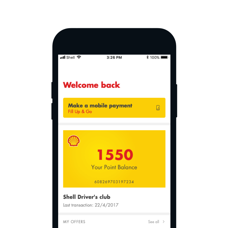
Shell app features a loyalty program, as well as a possibility to manage payments via mobile phone. Stated features provide our users and business value of the app. Mobile payments allow users to pay for fuel on Shell stations, using mobile phone only. The process is simple, as the users just drive to Shell station, click “Make a mobile payment” button and start to fuel up their vehicle.
Something in our payment flow is not working right
We were noticing a big drop off of users throughout the process of starting the mobile payment transaction to successfully finishing payment. This could be caused by a million of reasons - of course, you always think of the worst, so we thought that something was not working with our payment provider - luckily all was good there.
Secondly, we thought that maybe GPS positioning is not working or that something is wrong in the back-end, that is feeding Shell stations location. This could be a major problem as users would be situated on a station, ready to make a mobile payment and the app would not be able to locate them. Also luckily for us, all was good on that end.
So, nothing was wrong on our end (or at least we thought so at that point), but we were still indicating a huge drop-off. What could be causing that problem?
We decided to investigate the journey of users not completing the transaction, to find the step where the drop-offs occurred more frequently. But let’s first look at the existing transaction flow:
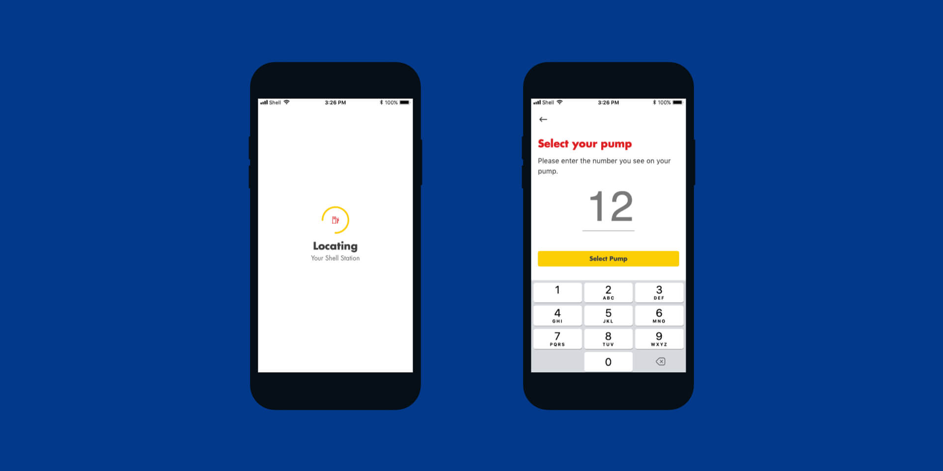
When the user clicks on 'Make a payment' button, the first step is to locate them and the station they are present at. If no stations are found around the user, the error message is shown and they can retry the search or exit the transaction flow.
So what exactly is the problem?
We noticed that if users get passed the locating station screen, in most cases they also finish the transaction. So the problem is the step of location the station. But if GPS is working and station data is correct, where is the source of this problem?
What we saw from data analysis is, that users experiencing this problem are nowhere near any Shell station. There could be 2 reasons behind this:
Users are clicking on ‘Make a payment’ button out of curiosity (or to learn how mobile payments work) and are not actually at any Shell station.
Users are located at the Shell station which doesn’t offer the possibility of a mobile payment.
Let’s solve the problem now
So, the locating station screen as designed and built currently, is a problem. Once our users start the transaction (even if accidentally) there is no way to stop the process - they can only wait and get the result (either station found or error message).
Before going to an implemented solution, let’s look at some examples that we have tested and have led us to some insightful learnings.
Having QR eliminates chances of errors, but requires extra camera permission. The main reason this solution was quite quickly discarded, is related to costs and maintenance - generating, printing and maintaining readability of so many QR codes is time-consuming and extremely costly.
Adding cancel button (X in top left corner) could be a quick fix to the problem, but does not have a big impact on the experience of transaction.
Having a map with available Shell stations still needs some loading to retrieve all the locations.
Improving error message is more like a very nice blister to the wound - it makes message clearer, but users still needed to wait through the screen, searching for location.
Drumroll please
We wanted not just to solve the problem for users experiencing an error, but also to improve the overall transaction flow to make it shorter and seamless. We put the process of locating the station in the background and have brought forward the screen that prompts users to enter their pump number.
Bringing forward the screen that prompts users to enter their pump number, and leaving the process of locating the station in the background, should prevent users that accidentally click on 'Make a payment' button getting the error message. Also, by not having the loading screen for locating the station, the payment journey was now faster.
Based on our explorations, we decided to as well improve the error message, to provide more context and clearer actions.
With new design language and improved flow, the whole experience of mobile payment was faster and seamless.
Final thoughts
Even small changes can make big improvements to user experience. Just by removing the loading screen for locating the station and putting it in the background of pump number, we have shortened the user journey. Finally the users that accidentally clicked on ‘Make a payment’ button, or curious users that just clicked around the app, were able to exit the app faster and without waiting for the error message. Really valuable input is to always look at analytics and analyse the cause of several scenarios, as this already is the first step towards a more optimized solution.